Overview
The Crimson Balance
CLIENT:
INDUSTRY:
Charity, Healthcare
PROJECT TYPE:
SERVICES PROVIDED:
Conceptual Website Design
Web Design, UX/UI, Branding
PROJECT DURATION:
February - March 2025
TOOLS:
Figma, Squarespace, Chat GPT
LINK:
The Challenge
I chose this project because I have a keen interest in all things vampiric and wiccan, and had the random thought of, “What if vampires were real, and were seeking same sort of community that those of the LGBTQ+ has, and those newly bitten were looking for a safe haven in which to navigate their new lives with others like them?”
The Solution
I looked at the online content and structure of services online for mental health patients (counselling, etc), to help me with narrowing down the overall vibe of the website, to help me ground it in some elements of reality.
How can this website alleviate the stress and answer the questions a potential user would have? How can I communicate trust, offering a variety of therapies, and retain new clients by rewarding them with a strong sense of community from other service users?
It was also very important for me to be creative and play with the more fantastical elements - as it pertained to hypothetical counselling services for newly turned vampires.
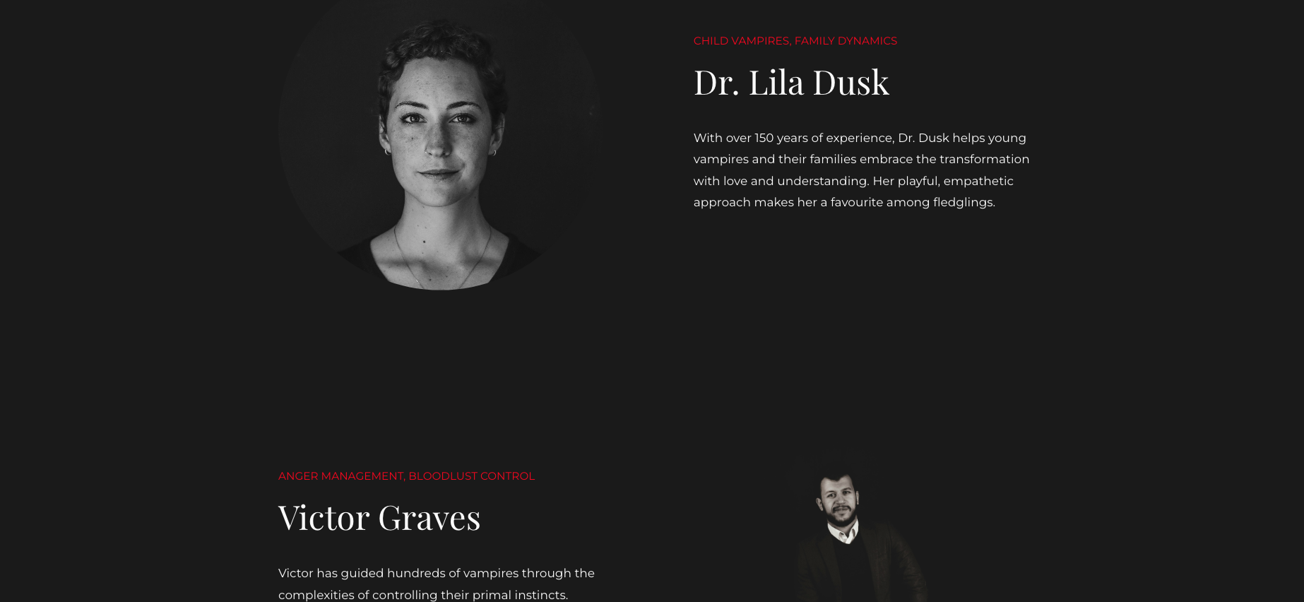
Family dynamics
Romantic relationships
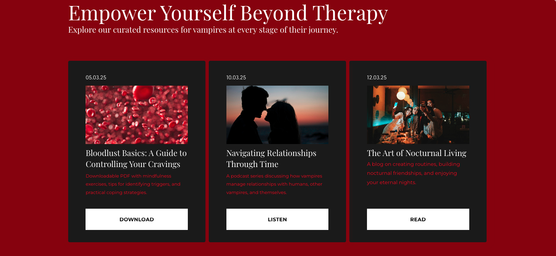
Blood lust management
The choice of typography was inspired by elements of Art Nouveau lettering - namely the headers, with the paragraph text kept to san-serif for readability.
According to vampiric folklore, vampires are active from sundown, so it made the best sense for the website to be in dark mode. I reviewed a few other non-related websites that were designed for dark mode, before finalising a colour palette that whilst was typical for the clientele, was on brand.
I experimented with alternating some of the sections having a white background, but after testing this on some users, the overall response was to restrict the white colour to text and accents only.
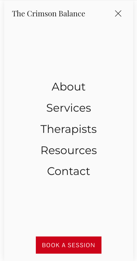
Mobile Responsive
Expected Impact
Better user engagement
Clear call-to-action buttons per section and/or per page.
Simplified appointment booking process on the Contact page, to allow the team to better tailor their services to new clients.
Higher Conversion Potential
Reflection
I was able to be creative with this project, but I actually found it quite challenging to complete. If I were to redo the project, I would experiment with more dynamic layouts and colour palettes, and incorporate code snippets to further elaborate the functionality for the user whilst navigating around the website.


