
The Overview
El Estudio
CLIENT:
INDUSTRY:
Fitness
PROJECT TYPE:
SERVICES PROVIDED:
Homepage redesign
PROJECT DURATION :
Web Design, Branding
February 2025
TOOLS :
Figma, Squarespace
The Challenge

El Estudio is a boutique fitness brand that offers exclusive reformer pilates classes in North West and North London.
I wanted to redesign the homepage as I felt that there wasn’t any clean branding in place, the architecture appeared to overwhelm the user with too much information and there was no call to action in the first third of the page.
The overall vibe of the hero section didn’t spark motivation due to the colour palette.
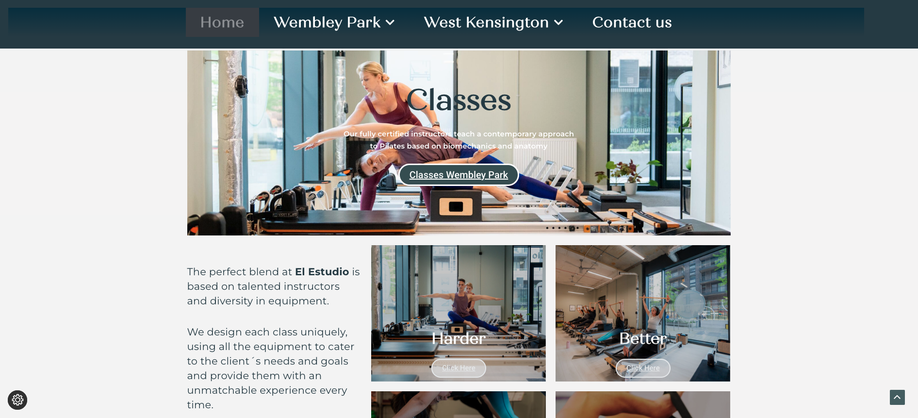
There were a number of readability issues, especially with the choice of typography, font weight, and colour contrast, against an image background.
The white space between content needed to be increased, and certain sections were removed (for potential use on other pages).

The overall layout would benefit greatly from an update in terms of visuals, but also for there to be an obvious journey from the user to take as they skim the page.
The Solution
The new colour palette takes inspiration from the existing colours on the homepage, but reduces them to enough to showcase text, backgrounds and accents. The palette is more cohesive and inviting, thus enhancing the user experience.

Clear and concise call-to-action in the hero section and proceeding section featuring information for new potential clients. Further information on the Intro Pack would be available after clicking “BUY NOW”.

Typography is now in san-serif, with clear distinction from H1 to paragraph to buttons. This way, the user can clearly see absorb information in a more legible manner.

Testimonials further down the page to help the user decide whether to part with their money or not - it’s one thing for a business to state its features, but if reviews are bad, or non-existent, this has great impact on brand loyalty.
Expected Impact
Simplified navigation removes user choice paralysis
Less overwhelming for first time users
Returning clients can easily access their accounts via the button in the navigation
A sleeker interface with clear branding that is memorable and appropriate for the business
Concise content on homepage results in a reduction in scrolling on mobile


